
It’s been trending this way for years, but seeing it graphed out like this is shocking.
What do you think are the effects of this drastic change?
You must log in or register to comment.
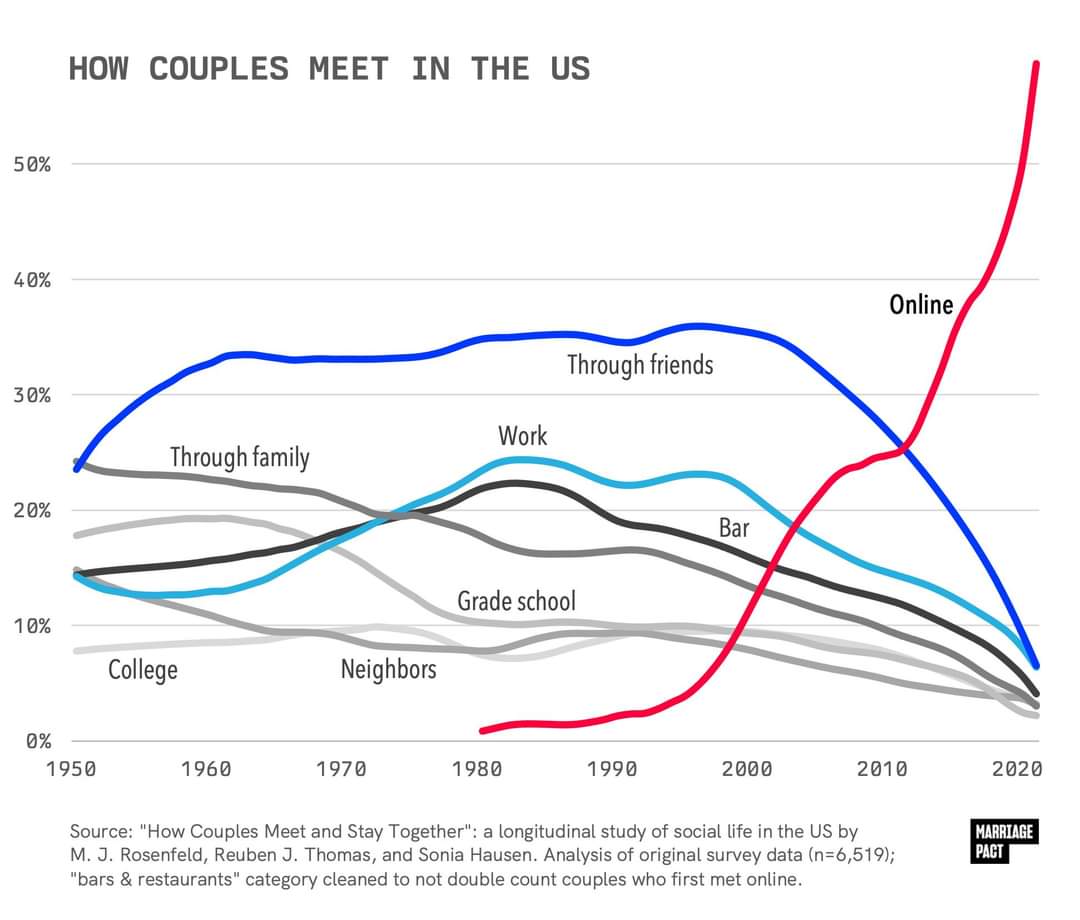
This is for same sex couples which for a large variety of societal reasons likely wont reflect the dating scene among the average population, which skews heavily hetero.
Oh shoot, you’re right. I grabbed the wrong one. I was just looking at the dates.
The hetero graph in this article only goes to 2009, so this whole article probably isn’t too helpful. I’ve removed. Thanks
